A Lean Approach to Measurement Systems Analysis
Abstract
Measurement System Analysis (MSA) is a prerequisite to top-notch experimentation, but sometimes economic pressures and deadlines result in an understandable reluctance to act on this knowledge. The current economic climate presses us to do more with less, so it’s common to scrimp on the MSA. This paper suggests an alternate way forward – a lean approach that lets us use data collected for an experiment to also do a measurement sanity check.
Thankfully, JMP implemented Donald Wheeler's EMP III approach to MSA [1] allowing us to use this measurement sanity check in lieu of a full MSA when we have a compelling reason to save time. The measurements made on replicate runs in a Designed Experiment are first visualized and then analyzed, thus allowing us to judge the suitability of our measurement system for the purpose at hand. If the quality of the replicate run data is poor, the collected data are chalked up to an MSA indicating the need for further study of the measurement system and corrective action. If the data quality is good, the data does double duty and we proceed with analysis of the experiment data. This is a risk-free, no-cost shortcut done as an integral part of the experimental work.
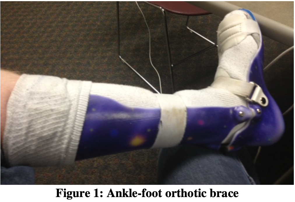
The remainder of this paper describes this method in a case study format about the development of a new polymer orthotic brace design similar to the one shown in Figure 1. The case study has a dual emphasis on the EMP III measurement sanity check used during the development work and the use of JMP’s powerful data visualization tools. It is hoped that with this case study in hand, the reader can immediately begin using this useful MSA shortcut and to that end, the focus is on practical application, not theory.
The Case Study
Note: this case study is based on actual events, but confidentiality required modification of experiment details and simulation of the experiment data.
A team had to develop a new orthotic brace for a large customer with difficult technical, cost and delivery targets. The company sales people determined that immediate orders were available and were applying major pressure to establish the new brace as a standard product. Once the inaugural order was placed, liquidated damages applied for late delivery, so the team was anxious about possible startup problems and they had to address them prior to actual production. And to make matters worse, they had to succeed within the limitations of existing production equipment and stock materials.
Machine time and raw materials were available, but the team was also under heavy management pressure to minimize resource consumption because developmental costs directly impacted company profits.
The design itself was novel, so the team had no experience or historical precedence on which to launch their work. This was a pressure-packed assignment that demanded lean thinking…
The Product & Process
Orthotic braces are used to treat a range of walking dysfunctions and are custom fit to each patient, usually by a Certified Orthotist. The braces range from simple athletic shoe-sized designs for treating mild gait dysfunctions to full leg braces for treating complex problems. In either case, the end result is increased mobility and quality of life for the patient.
The process used to make these braces include the following steps:
- Cast the patient’s foot and prescribe brace
- Create a mold to duplicate the patient’s foot
- Modify the mold for therapeutic purposes
- Vacuum form the brace over the mold
- Fine finish the brace.
Step 1 is done by the Certified Orthotist while the other steps are usually done by a company specializing in centralized brace fabrication.
The Team
The development team consisted of an R&D Engineer, a Production Manager, a Process Engineer, an Inspector and some experienced Line Operators. It was thought that a wide range of skills was needed to assure a successful startup and long term success. However, this approach presented a challenge as some personnel were unfamiliar with the methods deemed necessary for the development work.
Many recent books on process improvement methods [2,3] provide convincing example after convincing example of the power of data visualization and with that in mind, the team decided that team member education was needed first despite the pressure to get going. A hands- on workshop in Lean Statistical Thinking was provided before the work started and it was well received by the participants. They found the following exercise particularly useful to the point that the team leader called it his visualization slam dunk for beginners.
Lean Statistical Thinking Exercise
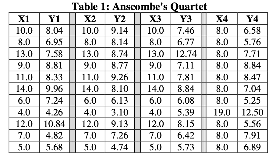
Anscombe’s Quartet (Table 1) provided the team with a fine demonstration of the grave dangers lurking in data analysis based solely on descriptive statistics.
For all XY pairs in Table 1
- Mean of X1, X2, X3, X4 = 9.00
- Standard deviation of X1, X2, X3, X4 = 3.317
- Mean of Y1, Y2, Y3, Y4 = 7.50
- Standard deviation of Y1, Y2, Y3, Y4 = 2.032
From a descriptive statistics viewpoint, all 4 paired datasets are equal. However, when viewed with JMP scatterplots (Figure 2), the team saw a remarkably different picture.
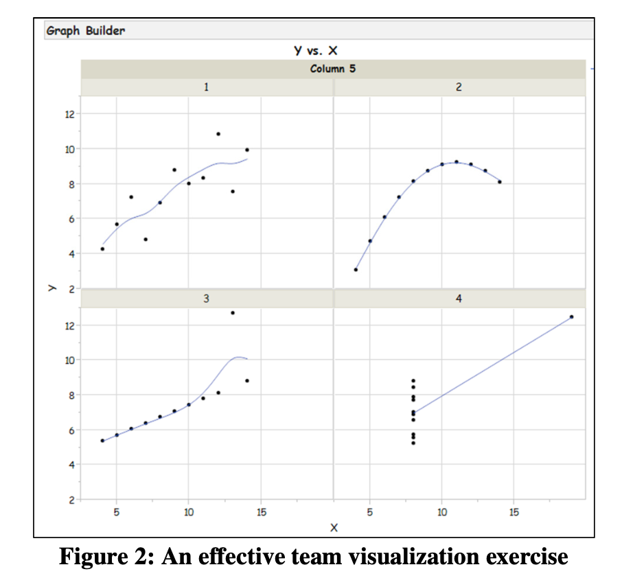
The team found that data visualization immediately triggered keen interest and enthusiastic discussion and they unanimously agreed to avoid their historical reliance on descriptive statistics. They further agreed to instead use JMP to visualize as many of their findings as possible.
The Strategy
The team started by writing a clear definition for each goal, paying careful attention to the Voice- of-the-Customer and the Voice-of-the-Process. They used a handy document titled Checklist for Asking the Right Question [4] to avoid missing any key points.
Being knowledgeable about DOE, the team chose to move forward with an I-Optimal (quadratic) design created with JMP’s Custom DOE designer. The team noted with much satisfaction that I-Optimal DOE is itself very lean as it maximizes return on experimental resources and allows inclusion of user-specified replicate runs. JMP does not force the experimenter to suffer the costs of full replicates or the limitations of replicating only center points.
The Tactical Plan
Strategy in hand, the team discussed its tactics and gained consensus on the best way forward.
Experimental Factors & Responses
The team designed its experiment with 4 factors – temperature, vacuum, vacuum time and cooling time. The team maximized predictive ability by setting the factor ranges at the widest levels allowed by the equipment. The experiment had 2 responses - one technical response to be maximized (Maximize This) and one commercial response to be minimized (Minimize That)
Replication
The team knew that measuring response variation was critical so they decided on 8 replicate runs, knowing they could easily augment the design for more replicates, if needed. The experimental design input screen is shown in Figure 3. Note the Number of Replicate Runs field as it is a main advantage of I-Optimal DOE.
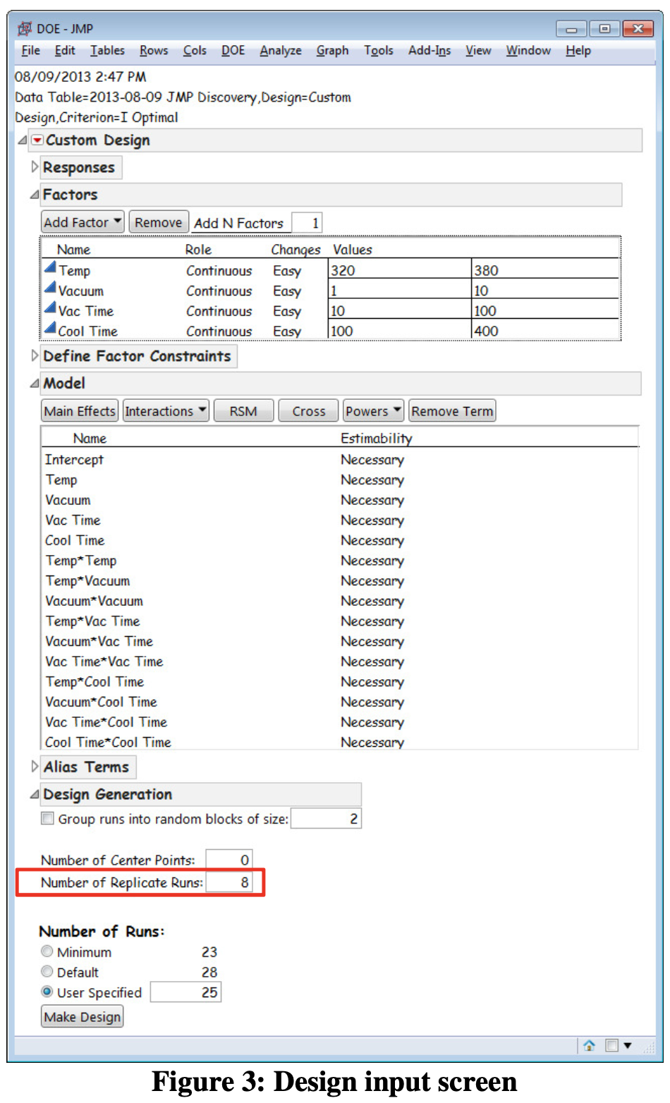
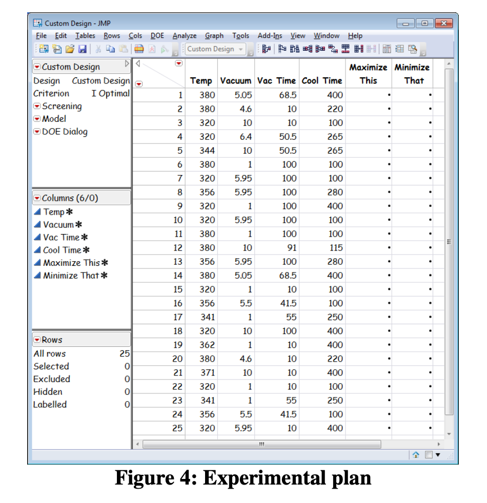
Figure 4 is the experiment plan. Note that only 25 trials are needed, including the 8 replicates.
Implement the Plan
While it was tempting to immediately execute the plan, the team knew that good DOE practices include careful consideration of an important prerequisite – checking the measurement system.
Validate measurement system (Part 1 of 2)
The team knew that skipping Measurement Systems Analysis would leave them vulnerable to misinterpretation of experiment results but at the same time, the team had a deadline to meet. They knew that performing a full AIAG measurement systems analysis (full factorial experimental designs themselves!) would take a lot of time and they knew these methods had arbitrary decision rules that could result in conflicting assessments.
Fortunately, Dr. Donald J. Wheeler’s EMP III measurement systems analysis method [1], provided the perfect solution. JMP’s unique ability to provide EMP results allowed the team to plan on the use of the 8 replicate runs to do a measurement system sanity check. This approach also had another advantage – that it is probability- based and devoid of arbitrary decision rules. This approach is a risk-free, no-cost addition to experiments with replicated response data.
Collect the experimental data
When the team began running the experimental trails, they were asked by supervisory staff to perform the trials in batches. They were asked to run all Temp = 300 F first, the Temp = 340 F next, etc. The team used the JMP Custom DOE designer to visually walk the supervisors step-by- step through the experimental setup to explain where the random order came from. They further explained why randomization is important to negate the possible effect of variables that were not included as experimental factors – ambient temperature or material variation, for example. The supervisors understood and agreed. Again, JMP visualization saved the day.
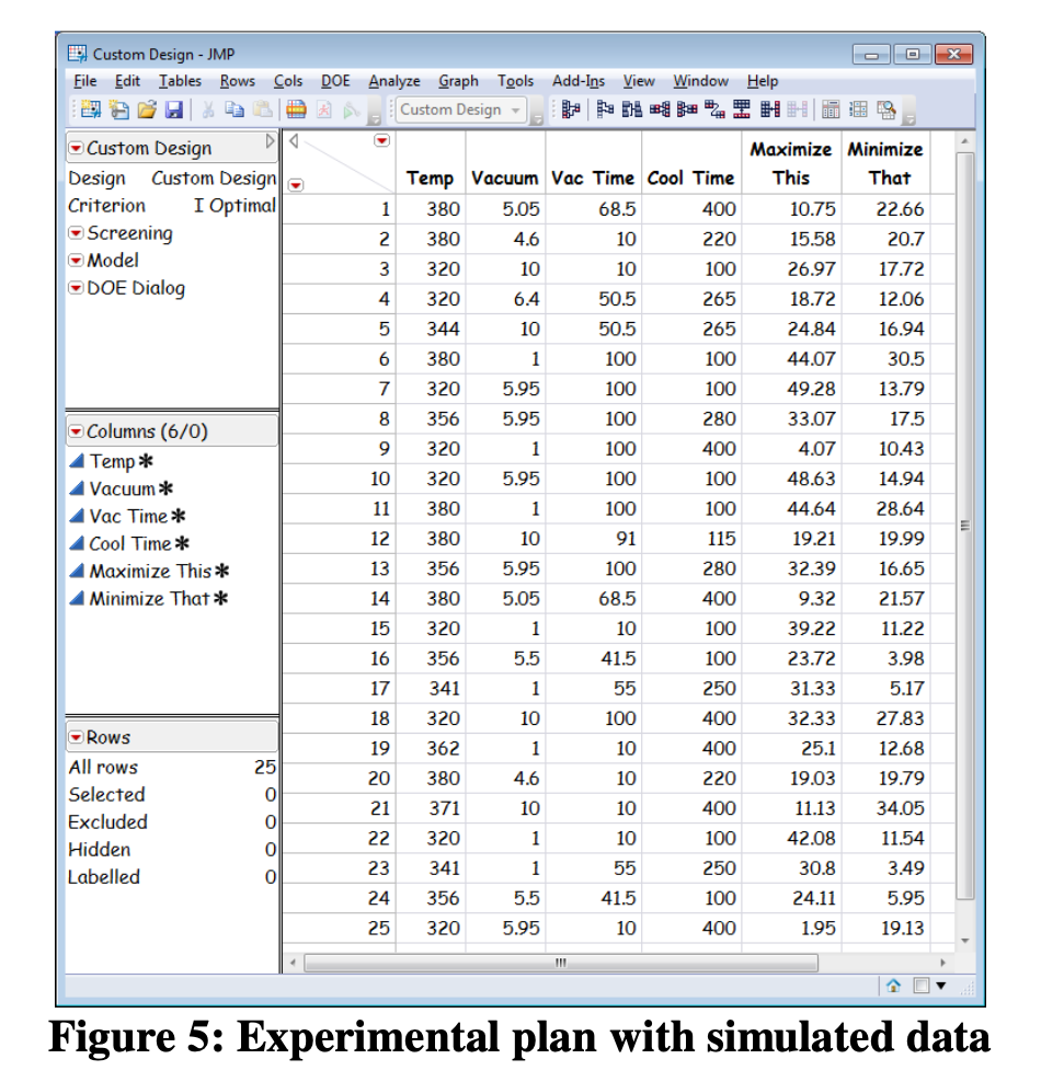
Figure 5 shows the simulated response data. Note for example that Trial 1 and Trial 7 are the same set of conditions (340 F, Vacuum=9.6, Vacuum Time=68 and Cooling Time=300). It is these replicate runs that provide the opportunity for a measurement sanity check.
Check: is the standard deviation “constant”?
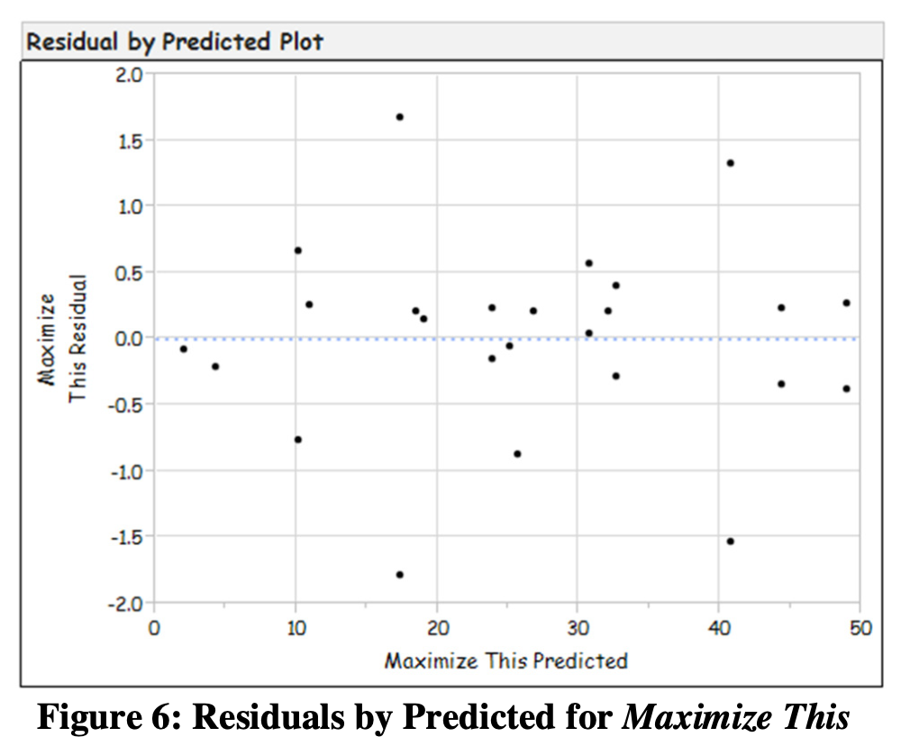
Models assume that response standard deviation is “constant” at the repeated experimental points. There are 3 methods used to evaluate the homogeneity of the standard deviation. They are the Normal Probability Plot, the Residuals- by-Predicted Plot, and the Box-Cox Plot. The team was delighted that all 3 methods are visually-based. If 2 out of 3 pass the evaluation, then the team could assume the response variation to be constant. If 2 or more fail the test, the team would have had to transform the data before proceeding.
Figure 6 is the Residuals-by-Predicted Plot. When reviewing this plot, the team looked for patterns that might indicate the standard deviation is not constant. Fortunately, this plot indicated no such patterns. Visual evaluation of the Normal Probability Plot and Box-Cox Plots provided good results a well and the team concluded that the standard deviation is indeed constant and that they could proceed to the next step.
Validate measurement system (Part 2 of 2)
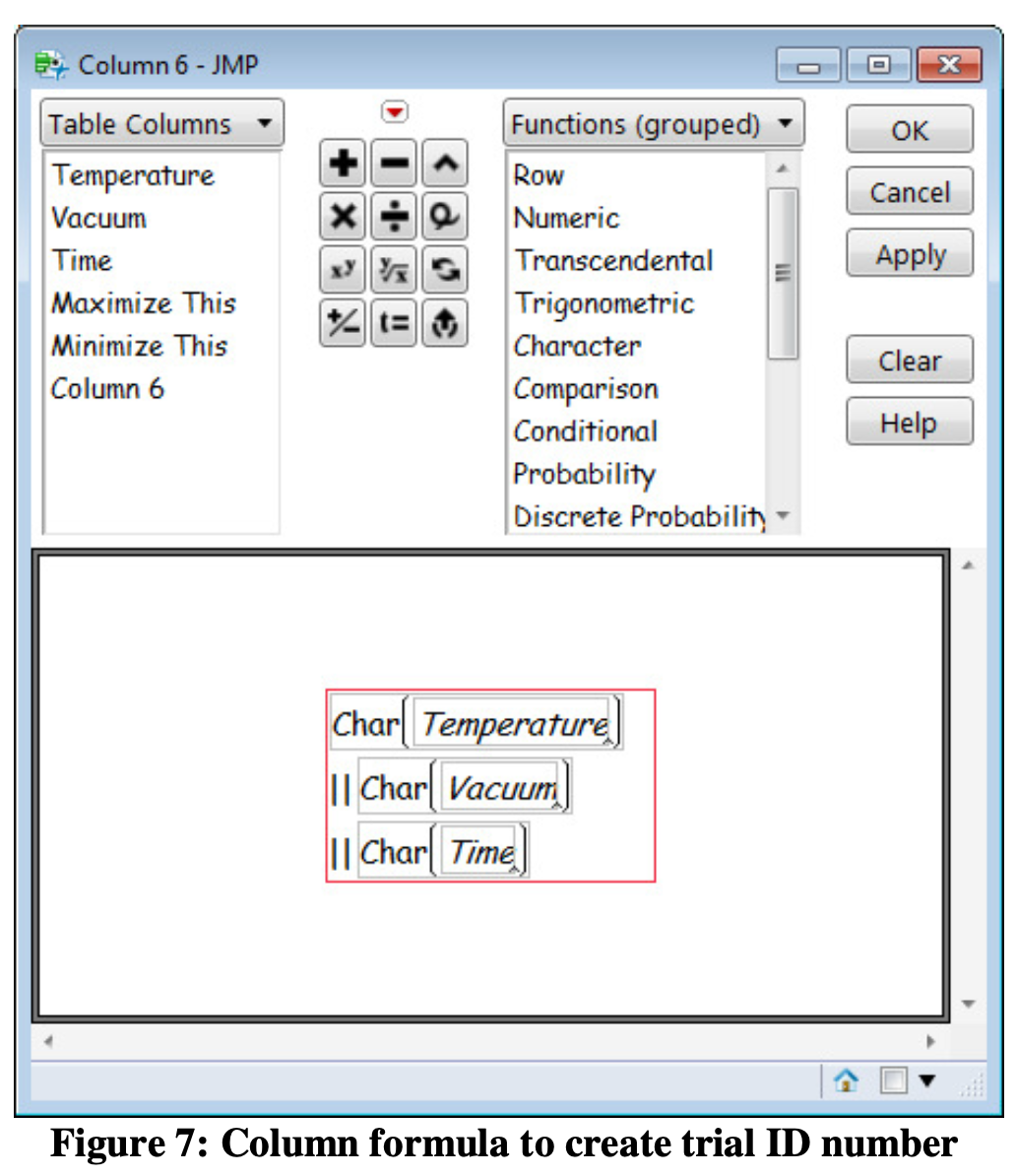
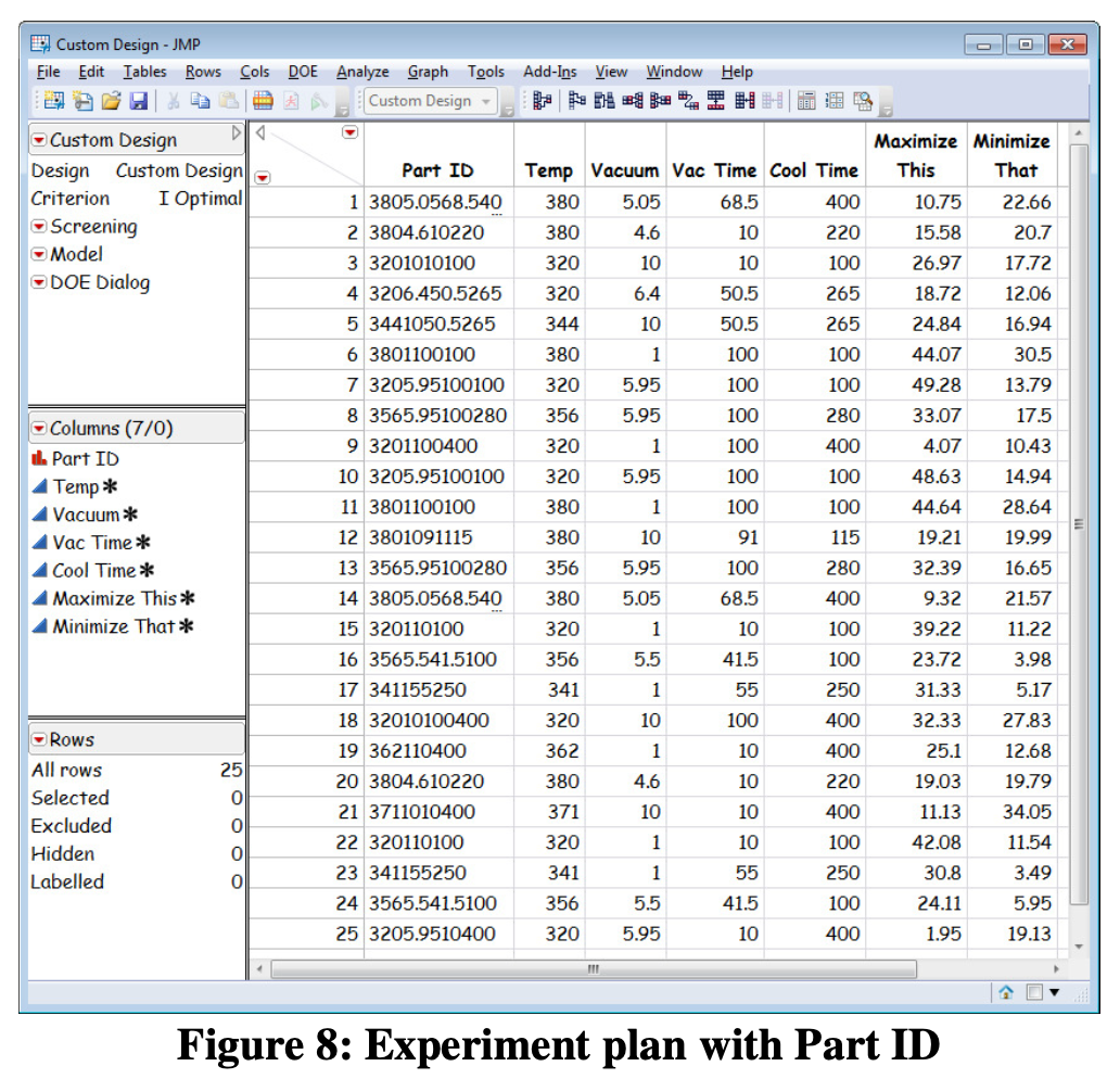
Upon review of the experimental data, the team ran into a problem. To perform the measurement sanity check, they needed an identifier to match the replicate runs together. The team wrote a column formula to accomplish this as shown in Figure 7 while Figure 8 shows the experimental plan with the trial identifier.
A JMP Add-in to automatically create the trial identifier is available at www.obdoe.com.
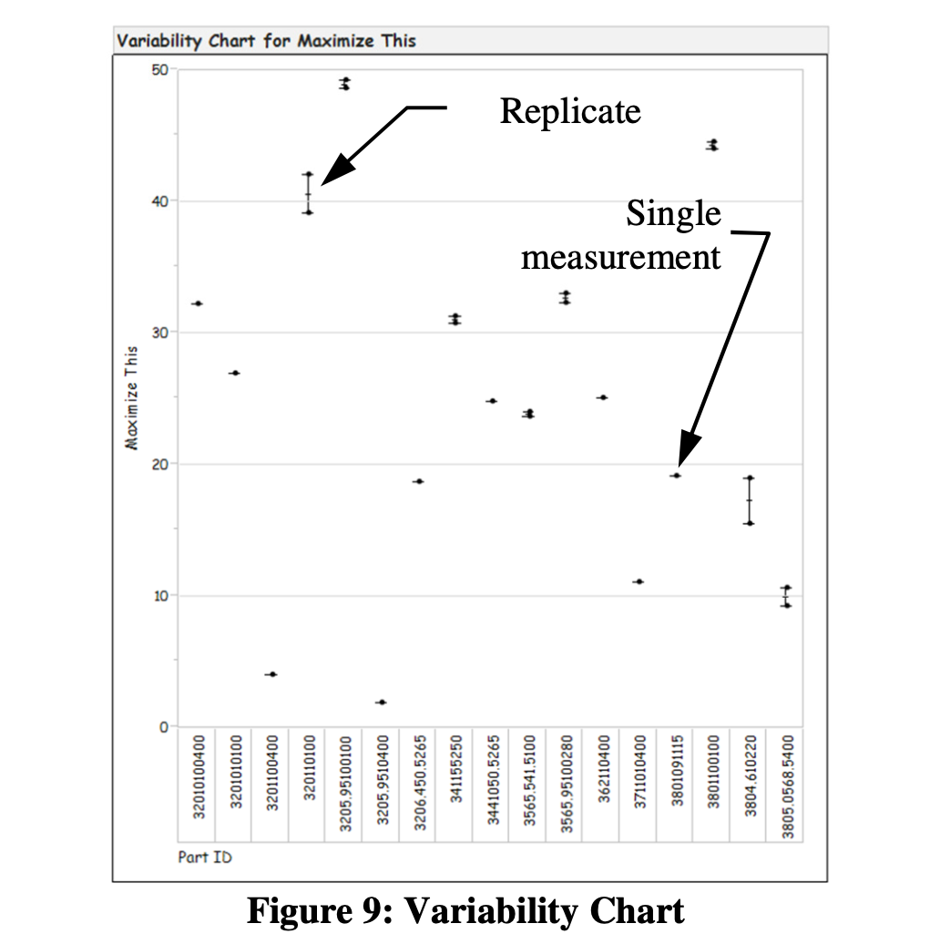
With everything in place, the team ran an EMP check on the replicate runs. Always defaulting to the visual, they first checked the Variability Chart as shown in Figure 9. This simple graph provided a fine overview of all of their response data and put their ability to replicate results into good visual perspective. They also used the Variability Chart to clearly explain results to staff not directly involved with the work.
Evaluation of the EMP results (Figure 10) provided the team with a numerical way to assess their measurement system.
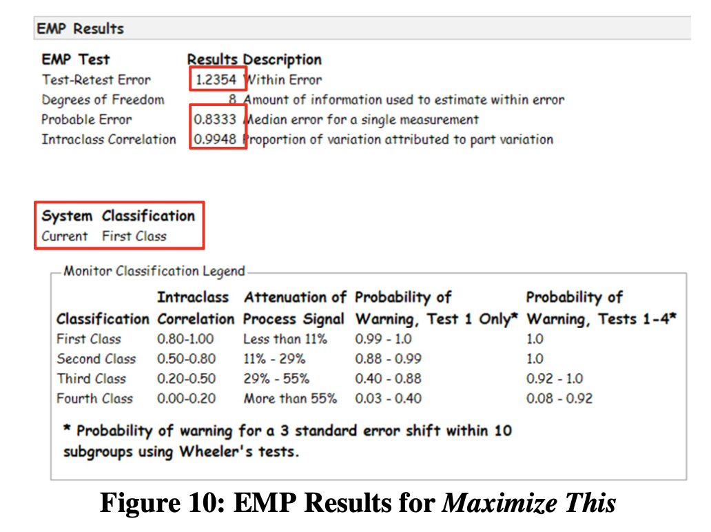
Test-Retest Error
The Test-Retest Error gives insight on measurement repeatability. Normally, the Test- Retest error is used to evaluate operator repeatability, but for the EMP sanity check, we use it to better understand experimental response repeatability. In this case, the Test-Retest Error is 1.24 and quite small compared to the range of the experimental response variables. The team had good corroboration for the replicate run insight they got from the Variability Chart.
Probable Error
The Probable Error, introduced by Wilhelm Bessel in the early 1800’s, is the standard deviation times 0.675 and is widely used in the EMP III measurement method. Figure 11 is a visualization of the simple rationale behind the Probable Error calculation.
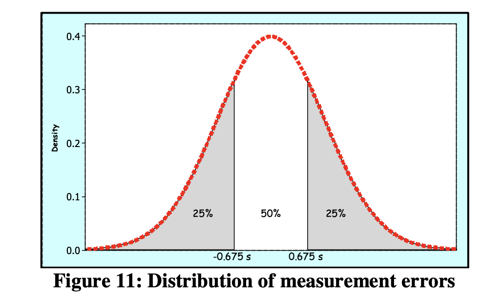
In words, Probable Error is the median error for a single measurement. In this case, half of the measurement errors will be greater than 0.83 and half will be less than 0.83. The Probable Error compares favorably with the 2-50 range of values for Maximize This.
Intraclass Correlation
The Intraclass Correlation indicates the proportion of measurement variation that comes from repeat trials (“parts”) rather than from the measurement system itself. The team noted a highly satisfactory value of 0.9948.
System Classification
The EMP III method provides a probability-based classification for the measurement system. In this case, the First Class Gauge classification gave the team a useful, probability-based assessment of their replicate runs.
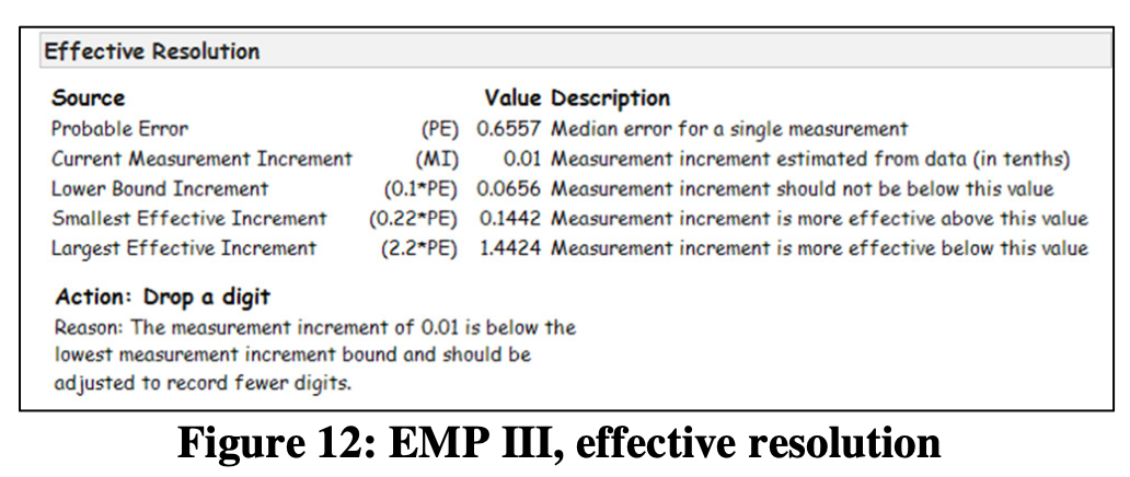
Effective Resolution
JMP also provides information and recommendations regarding the effective resolution of the measurement system as shown in Figure 12. The team found that they could drop a digit from their measurements without any measurement degradation.
A tough question from the boss
As it turned out, the company Engineering Director had automotive experience and was used to reviewing Gauge R&R data in the AIAG format. JMP has a visual summary specifically for that type of person as shown in Figure 13.

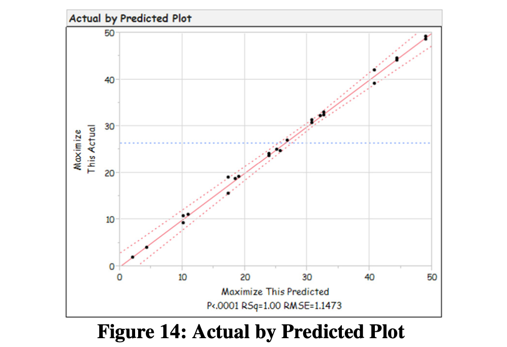
Check: does the model appear useful?
The Actual by Predicted plot provided a visual way to assess the ability of the model. The results were good (Figure 14).
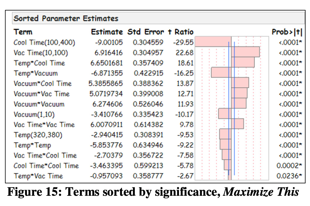
Gain process insight
The team realized that JMP’s highly visualized Fit Model output provided a superb opportunity to gain valuable new process knowledge. For example, as shown in Figure 15, for the Maximize This response variable, the team learned that the Cool Time and Vac Time main effects were the most significant. Conversely, the team noted that the TempVac Time interaction and Cool TimeCool Time were least significant.
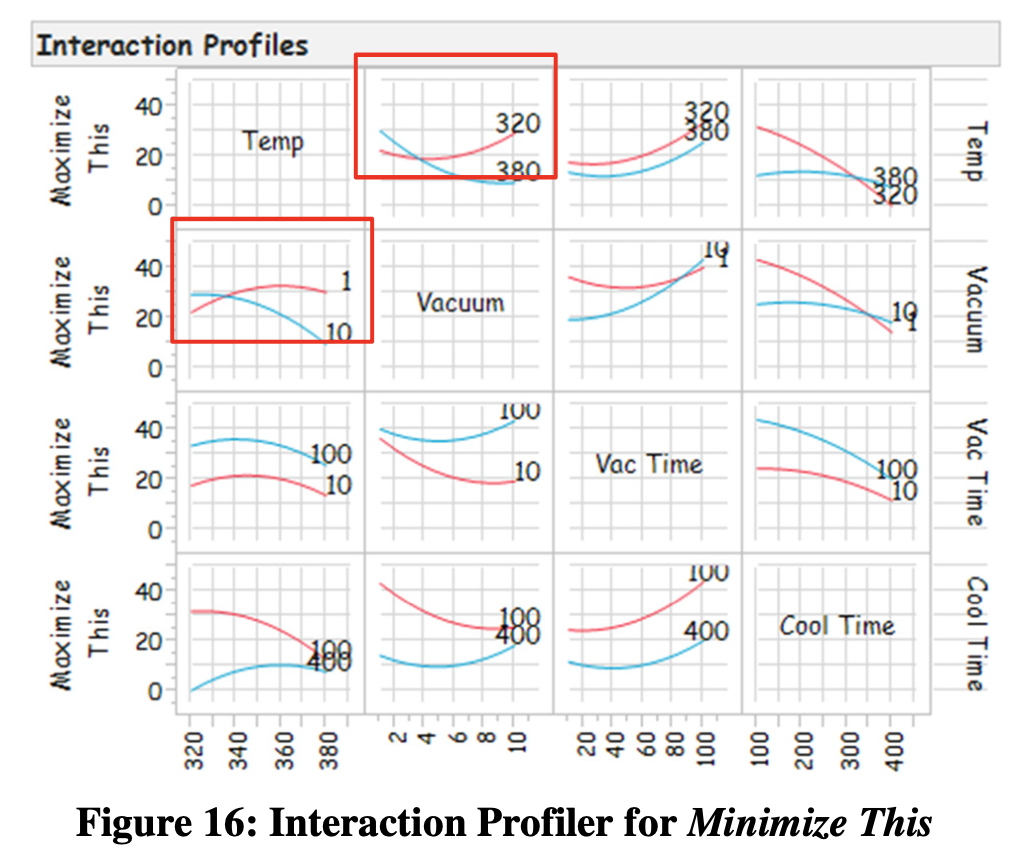
The team also gained valuable insight into their process using the Interaction Profiler as shown in Figure 16. The team instantly saw a number of interactions for the Maximize This response variable including one between Temp and Vacuum. The team realized the profound value of this insight as process knowledge that’s never found in an equipment manual and rarely learned by trial and error.
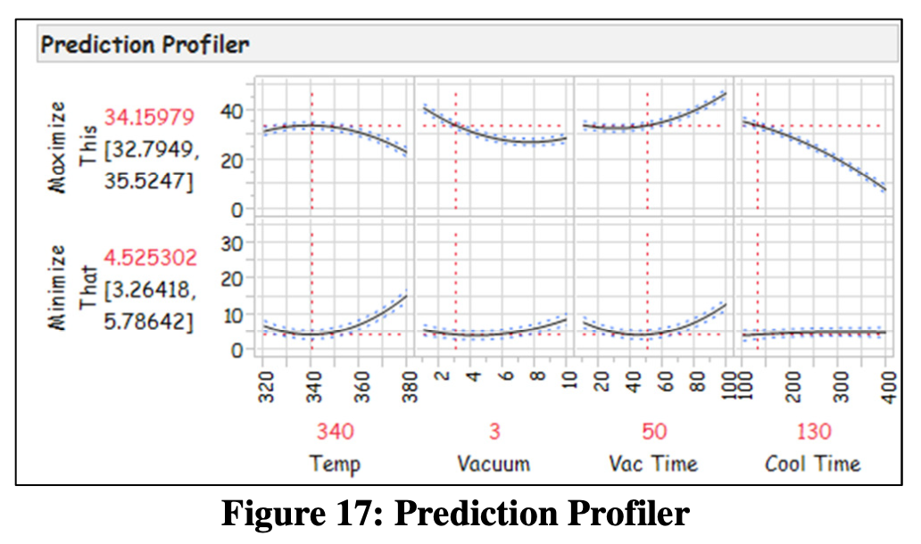
Find a sweet spot
The highly visual JMP Prediction Profiler, shown in Figure 17, allowed the team to visualize different combinations of factor settings and instantly see the effect on their 2 response variables. After discussions and lively debate, the team reached consensus on the right balance between the Maximize This and Minimize That response variables. Specifically, they chose a Temp of 340 F, a Vacuum setting of 3, a Vac Time of 50 and a Cool Time of 130 provided the best practical balance of the two responses. At this point, the team felt an overwhelming, very gratifying level of accomplishment.
Test the model and sweet spot
The next logical step was for the team to determine the prediction interval and use it to validate the model and the sweet spot. The validation was successful.
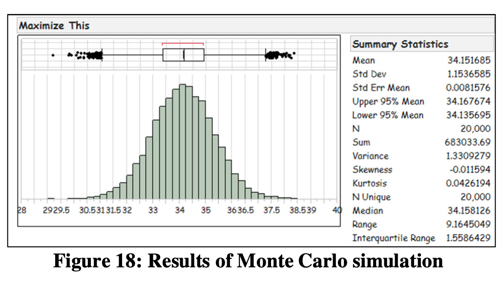
Another pause to gain process insight
Never passing on an opportunity to visualize data and gain more and more process insight, the team ran a Monte Carlo Simulation of 20,000 runs at the chosen sweet spot and visualized the distribution of the simulated results. This provided the team with an early indication of process capability.
Step 5, Celebrate & Monitor Progress
The team did not view this work as a “project”, per se, but rather as the beginning of many iterative cycles of learning about their new brace design and process.
Process Behavior Study
The team was on a roll. They had valuable new knowledge in hand and a new process making high quality orthotic braces, creating happy customers and spinning profits. But they knew that entropy is merciless and that keeping the process running profitably required continuous learning and continuous improvement. Now was not the time for the team to take its eye off the proverbial ball. They needed a way to monitor their process.
The team settled on the use of an X-bar-R process behavior chart generated with JMP’s Control Chart Builder. This chart is very visual as shown in Figure 19 and, most importantly, it was kept at the production line and reviewed multiple times per day by Line Operators and Supervisors. Should the process begin to shift or indicate unexpected variation, everyone would know quickly and thus avoid mass production of unacceptable braces.
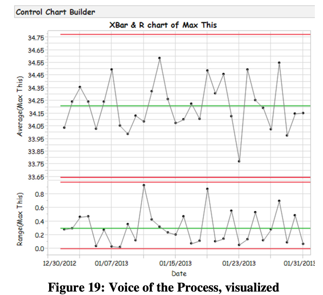
The team, recalling a video [5] they saw during their Lean Statistical Thinking workshop, realized that the data collected, analyzed and annotated by the Line Operators was a veritable gold mine of useful information. With that in mind, the team accumulated a detailed long-term running record of process behavior. They examined the performance of the new process, annotated process changes and observed the effects of the process changes. Eventually they witnessed narrowing upper and lower limits and they gained much new knowledge useful for process improvement, waste reduction and equipment maintenance.
Over time, additional iterative experiments were run to gain further process understanding, qualify new materials and drive more variation out of the process.
Case Study Conclusion
I-Optimal DOE is a powerful tool that’s useful across a broad range of industries and is well suited to manufacturing. EMP III is a superb Measurement Systems Analysis tool that makes it easy to understand measurement systems limitations and do so at minimum cost. Planned together, EMP III and I-Optimal DOE allow a manufacturer to evaluate their measurement systems and zero in on their process sweet spot using the same data.
A Final Thought…
The author and his colleagues at ObDOE hope all readers find that this case study helps you to begin using this technique immediately to save money and make your measurement processes leaner.
References
[1] Donald J. Wheeler, EMP III, Evaluating the Measurement Process and Using Imperfect Data, SPC Press (2006)
[2] Roger Hoerl and Ron Snee, Statistical Thinking, John Wiley & Sons, SAS Business Series (2012)
[3] Ian Cox, Marie A. Gaudard, Philip J. Ramsey, Mia L. Stephens and Leo T. Wright, Visual Six Sigma, SAS Institute, Inc., Published by John Wiley & Sons, SAS Business Series (2010)
[4] William D. Kappele, Performing Objective Experiments, 5th edition, ObDOE. Checklist is available at www.obdoe.com.
[5] Donald J. Wheeler, A Japanese Control Chart, SPC Press and Process Management International (DVD)
Acknowledgements
The author would like to thank Bill Kappele of ObDOE, Marilyn Nanquil and Denise Frey of Fiber Planners, Inc. for their review and valuable criticism of this paper. The author would also like to acknowledge and thank the contributor named CensoredBiscuit at commons.wikipedia.com for the orthotic brace photograph.
Author Information
Stephen W. Czupryna is a Consultant and Instructor for ObDOE. He has more than 20 years of manufacturing experience, a B.S. degree in Economics from Central Connecticut State University and an A.S. degree in Laser Electro- Optics from Springfield Technical Community College. He is a lifelong learner, Certified DOE Practitioner, Certified Six Sigma Black Belt and Certified Level 1 Thermographer.