For Your Measurement System, a Picture is Worth a Thousand Words
Abstract
Measurement System Analysis (MSA) is an important step in any endeavor requiring data. Gage Performance Curves provide a way to communicate the results of your MSA so that anyone can understand your results with a bare minimum of explanation.
Introduction
Measurement System Analysis (MSA) provides information on measurement system performance by analyzing measurement error from various sources. Communicating this information has often been a challenge, but not any more. Gage Performance Curves provide a picture of what you know about your measurement system that nearly anyone can understand quickly and easily.
What is a Gage?
A gage is any system for making a measurement–a Measurement System. It can be a ruler, a clock, or a chemical analysis. Referring to the measurement system as a gage is common, and it makes for less wordy explanations.
Gage Performance Curves
Presenting the results of your Measurement System Analysis can be challenging. You want your audience to understand what you do, quickly, without much strain on their part.
A Gage Performance Curve (GPC) provides just the tool you need. You can see a Gage Performance Curve in Figure 1. This is a graph of the actual amount of Fluoride in a water sample vs. the probability of accepting this water sample as having a Fluoride concentration within the specification limits. The bottom of the graph represents no chance of accepting a sample (0% probability of acceptance) while the top of the graph represents no chance of rejecting a sample (the probability of acceptance is 100%). The Fluoride concentrations along the bottom are actual concentrations–not the measured concentrations. Actual concentrations differ from measured concentrations because of measurement error. Everything between the specification limits (LSL and USL) is a good sample, and everything outside of the specification limits is a bad sample.
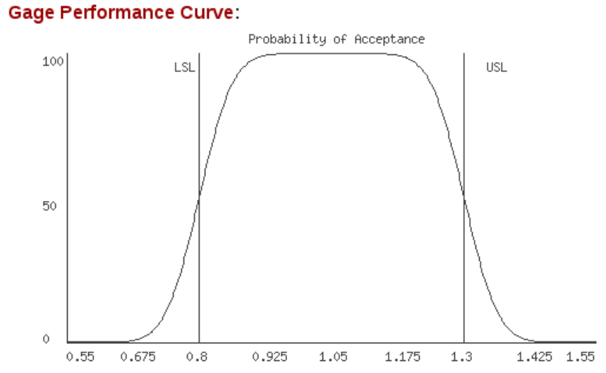 Figure 1. A gage performance curve.
Notice, in Figure 1, that there is a region between the Lower Specification Limit (LSL) and the Upper Specification Limit (USL) where there is no chance of rejecting a water sample as out of specification. As you approach either specification limit, the probability of acceptance decreases. There is now some chance that a good sample will be rejected simply because the measurement system is too noisy to be sure our sample is in specification. When you reach either specification limit, the chance of acceptance becomes 50%. This happens because measurement error will make the sample appear to be out of specification half of the time and in specification the other half of the time. Once you are outside of the specification limits there is still some chance of accepting the water sample as good even though it is out of specification. When samples are far enough out of specification you will have no chance of mistaking them for good samples.
The Gage Performance Curve is a handy picture of the strengths and limitations of a measurement system.
Gage Performance Curves and The Impact of an Untrustworthy Measurement System
To see the impact of an untrustworthy measurement system on your measurements, please take a look at the Gage Performance Curves in Figure 2. These curves show the chance for accepting bad parts increases as the measurement error increases. The chance for rejecting good parts also increases. When measurement error is 1%, your probability of accepting a bad part or rejecting a good part are very low except when you are very close to a specification limit. When measurement error is 20%, the probability of accepting bad parts and rejecting good parts is higher, but the system may still be usable. When measurement error is 50% you have less than 70% probability of accepting parts that are well within your specification limits–this system is just not good enough. When measurement error is 80% you really cannot discriminate your parts at all. You will be making decisions that are based mostly on noise–and you will think you have data! These errors lead to reduced profitability and poorer product quality. It's easy to see that you need to be using measurement systems with low measurement error.
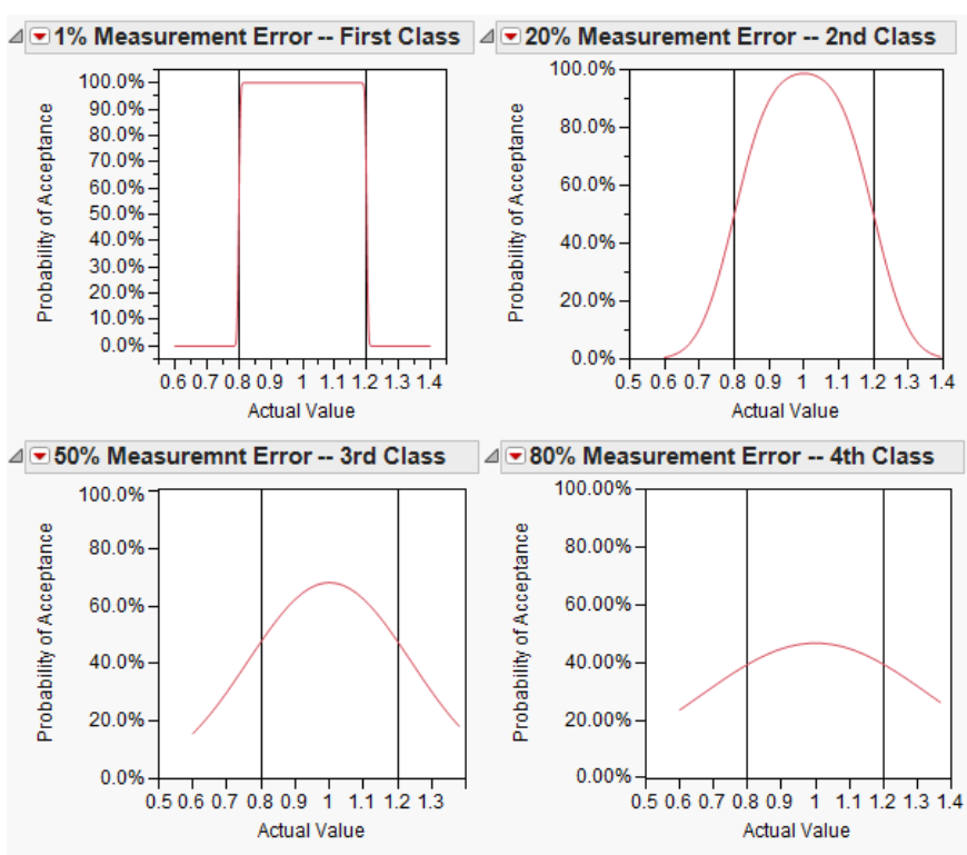 Figure 2. Impact of gage classification on gage performance curves.
Improving an Untrustworthy Measurement System
A Measurement System Analysis will tell you if your measurement system is trustworthy, and it will tell you what needs to be improved in an untrustworthy system. The source and magnitude of the errors are indicated. The largest source tells you where to focus your improvement efforts. You can show this to your peers and management using Gage Performance Curves.
Let's take a look at two examples to see how Gage Performance Curves can show the largest source of variability in a measurement system.
The first example is a measurement system for quantifying the amount of fluoride in drinking water. Please take a look at the Gage Performance Curves in Figure 3. The curve on the left shows the effect of all forms of measurement error together. The center curve shows the effect of noise in the gage alone, while the curve on the right shows the effect of different people using the gage. For this measurement system, noise in the gage is much larger than the variation in the people using the gage. This indicates that the gage itself needs improvement. In fact, the people using the gage are very consistent. When noise in the gage is large compared to variation in the people using it, work on improving the gage.
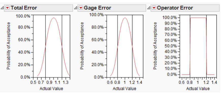 Figure 3. Error components for a fluoride measurement system.
The second example is a measurement system for determining the thickness of the copper walls in holes through printed circuit boards. Please take a look at the Gage Performance Curves in Figure 4. For this measurement system, variation in the people using the gage is much larger than noise in the gage. The gage is quite good, but the operators are not using it consistently. When operator inconsistency is larger than the noise in the gage, help your operators to learn to use the gage more consistently.
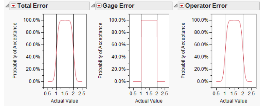 Figure 4. Error components for a copper thickness gage.
Learning to Make Gage Performance Curves Can Be Easy
Gage Performance Curves are very difficult to make by hand. The calculations are complex and numerous. Thanks to modern software you can now make a Gage Performance Curve in seconds.
Objective Experiments' specialty is making complex subjects practical. Thanks to the workshops like Practical Measurement System Analysis–EMP, and major advances in Statistical software packages, you can learn Measurement System Analysis with no math and a bare minimum of new terminology. The workshop will teach you to make Gage Performance Curves to display your results. Learning Measurement System Analysis can be fun and easy!
Conclusion
In this paper you have seen that Gage Performance Curves help you communicate the results of a Measurement System Analysis (MSA). There is a way to to save yourself a thousand words when you present your MSA results–use Gage Performance Cuves.